Let’s suppose you have compiled a large list (a series of rows that contains related data or a series of rows that you designate to function as a datasheet by using the Create List command.) of data—for example, sales figures for every product your company makes. You are now ready to extract some meaningful information from the data, and find answers to questions like:
- What are the total sales for each product by region?
- Which products are selling best over time?
- Who is your highest-performing salesperson?
To answer these and other questions, you can create a PivotTable® report—an interactive table that automatically extracts, organizes, and summarizes your data. You can use this report to analyze the data, make comparisons, detect patterns and relationships, and discover trends. Even charts and graphs are only a few clicks away.
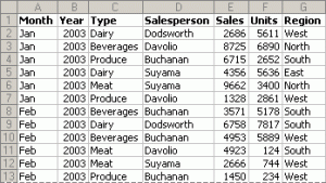
For example, the data you export may look like this:
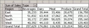
After creating a PivotTable®, the report may look as follows:
Other features of a PivotTable® include:
- Add or remove data
- Rearrange the layout
- View a “subset” of the data
- Show details that you want
Using a PivotTable® is an extremely powerful and effective way to organize a large amount of data for analysis and reporting. We at Keystone Financial Consultants have had training in using this tool and would like to share this knowledge with your organization.
Please contact us to set up a training session.